


Custom Dashboards & Threshold Alerts


This guide covers:
- Why the main dashboard is too noisy for most teams, and what a custom dashboard replaces it with
- How to build a dashboard: chart type, data filters, metric, and percentile
- How absolute and relative thresholds work together to cut false alarms
- How to route alerts to the right team by Client, Project, or Site level
- What dashboards and threshold alerts won't tell you
The main Niteco Performance Insights dashboard shows every test across every project. For a team responsible for one part of a site, that's noise: a payments team doesn't need homepage metrics cluttering their view, and a content team has no reason to watch checkout performance. Custom dashboards let each team build a view scoped to exactly what they own, and threshold alerts attach directly to that view so notifications only fire when a metric they actually track crosses a limit they set.
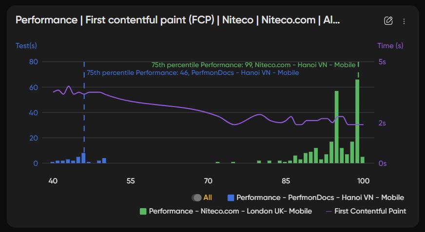
This matters more once a site has more than a handful of pages, or more than one team touching different parts of it. Without scoped dashboards and alerts, everyone either drowns in irrelevant notifications or turns alerts off entirely, which defeats the point of monitoring in the first place.
Why the main dashboard doesn't work for every team
One dashboard, every team's problem
A single shared dashboard has to represent the whole site: homepage, product pages, checkout, blog, campaign landing pages, all at once. That's useful for a high-level health check. It's the wrong tool for someone whose job is to keep one specific page fast.
What a scoped dashboard replaces it with
A custom dashboard is built around a team's actual responsibility, not the whole site. A payments team's dashboard can track Largest Contentful Paint on the checkout page and nothing else. A marketing team's dashboard can track Performance scores on campaign landing pages only, updated as new pages launch. Each team sees fewer charts, but every chart is one they'd actually act on.
How to build a custom dashboard
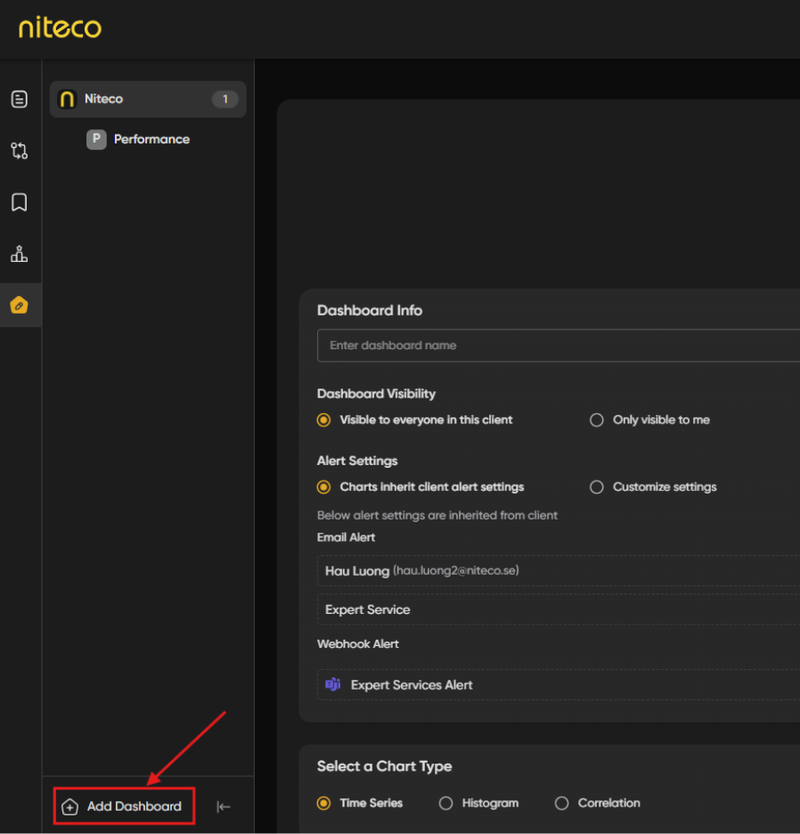
Create a dashboard from the Custom Dashboards menu and add charts to it. Each chart tracks a specific metric across pages, sites, locations, or devices.
Step 0: Go to custom dashboard screen
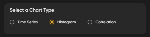
Step 1: Pick a chart type
Three chart types are available:
|
Chart type |
What it shows |
Use it for |
|
Time Series |
A metric plotted chronologically |
Spotting a slow drift in LCP over the last month |
|
Histogram |
The distribution of a metric across all data points |
Seeing how many tests fall outside your target range, not just the average |
|
Correlation |
The relationship between two variables |
Checking whether page size actually correlates with load time on your site |
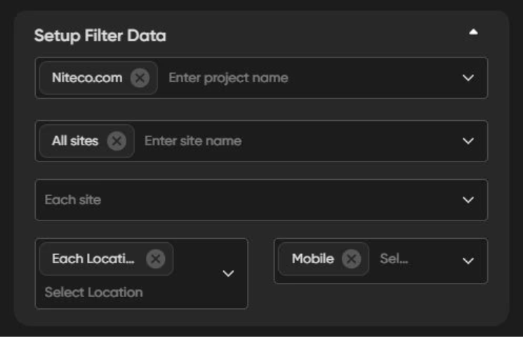
Step 2: Filter down to the right data
Define what appears on the chart by filtering on project, site, page, location, and device. A team that only owns checkout can filter the chart down to that one page, across whichever locations and devices matter to their audience, instead of averaging in data from pages they don't manage.
Step 3: Choose the mtric and the percentile
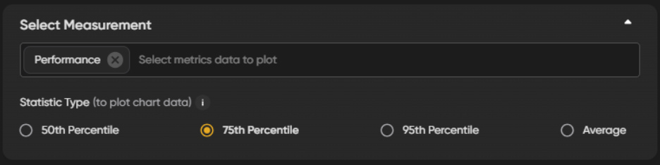
Select which metric to track, Lighthouse scores, Web Vitals, Page Load Time, First Contentful Paint, or another metric from your reports, then choose a percentile:
- 50th percentile (median): the typical experience. Half of all page loads are faster than this value.
- 75th percentile: the experience for most users, including busier conditions.
- 90th percentile: the slowest 10% of load times, useful for catching problems that only show up under peak stress.
Tip: If a dashboard only ever shows the 50th percentile, it can look healthy while a meaningful share of visitors are having a much worse experience. Pair a median chart with a 90th percentile chart for the same metric to see both at once.
Setting thresholds that don't create alert fatigue
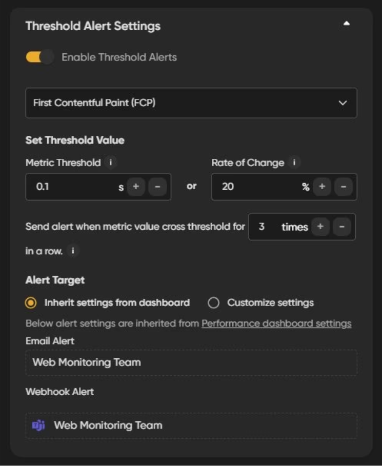
Threshold alerts attach directly to a dashboard chart. Instead of a notification for every test, a team only gets alerted when a metric they're tracking crosses a limit they defined.
Absolute and rate of change thresholds work together
The absolute threshold sets a specific value: if set to 90, an alert is tied to that number. The rate of change threshold sets a percentage around it. If the relative threshold is 5 with an absolute of 90, an alert fires when the metric falls below 85 or rises above 95. This variance is what stops a single unusually bad (or good) test from triggering a false alarm.
Worked example: checkout speed
A payments team can ignore Cumulative Layout Shift changes on the homepage entirely, since it's not their page, and instead set an alert on Largest Contentful Paint for checkout: absolute threshold of 2.5 seconds, relative threshold of 0.5 seconds. That fires an alert if checkout LCP moves past 3 seconds or improves past 2 seconds, wide enough to ignore normal test-to-test noise, tight enough to catch a real regression fast.
Routing alerts to the right team
Threshold alerts route via email, Slack, Microsoft Teams, or webhook, and can be configured at Client, Project, or Site level so different teams get different alerts. The payments team can see only checkout alerts. The marketing team can see only campaign landing page alerts.
Client level is the broadest scope: alerts here can cover uptime issues, failed tests, and threshold breaches across every site under that client. Project and Site level scope alerts down further, to one project or one site at a time, which is the more useful setting for a team that owns a specific slice of the estate rather than the whole account.
Note: A related feature, Site Change Alerts, notifies a team when a page's resources or console warnings change between test runs, useful for catching a regression the moment it ships, separate from the metric-threshold alerts covered here. See the Alerts & Budgets feature overview for the full list of alert types.
Practical alert setups for common teams
The specific numbers below are illustrative starting points, not fixed rules. Tune the absolute and relative values to what "normal" looks like for each page before locking them in.
|
Team |
Page / metric |
Threshold logic |
Channel |
|
Payments |
Checkout, LCP |
Absolute 2.5s, relative 0.5s |
Slack |
|
Marketing |
Campaign landing pages, Performance score |
Absolute 85, relative 5 |
|
|
SEO |
Category pages, SEO score |
Absolute 95, relative 3 |
Webhook |
|
Engineering |
All pages, Cumulative Layout Shift |
Absolute 0.1, relative 0.02 |
Microsoft Teams |
What custom dashboards and threshold alerts don't do
Dashboards in Niteco Performance Insights run on scheduled or on-demand synthetic tests, not Real User Monitoring. Niteco Performance Insights doesn't currently offer RUM, so a chart shows what your test locations and devices measured, not what every real visitor experienced. A metric can look stable in your dashboard while a segment of real users, on a device or network your tests don't cover, has a worse experience than the chart shows.
A threshold alert also tells you that a number moved, not why. It's a starting point for investigation, not a diagnosis. Pair an alert with the Harview waterfall analysis or a compare session to find the actual cause once you know something changed.
Finally, the relative threshold that prevents false alarms from one bad test can also delay a real one. A regression that lands just inside your variance window won't trigger until it drifts further, so it's worth revisiting thresholds periodically rather than setting them once and forgetting them.
Set up your own custom dashboards
- Identify the one or two pages your team is actually responsible for.
- Create a dashboard and add a Time Series chart for your primary metric first, expand to Histogram or Correlation once you know what you're watching for.
- Filter the chart down to just your pages, locations, and devices.
- Set an absolute threshold based on what good actually looks like for that page, not a generic target.
- Add a relative threshold wide enough to absorb normal test variance.
- Route the alert to the channel your team actually checks, Slack or Teams for anything time-sensitive, email for weekly review.
Custom Dashboards allow teams to configure threshold alerts so teams get notified of the metrics that matter to them most. Don't have a Performance Insights account yet? Set up a free trial and read the full documentation to get started.
FAQ
The absolute threshold is a fixed value, like a Performance score of 90. The rate of change threshold is a variance around that value, so with a relative threshold of 5, an alert only fires below 85 or above 95, filtering out noise from a single unusual test.
Yes. Alerts can be scoped at Client, Project, or Site level, and each dashboard's threshold alerts are tied to the specific pages and metrics that dashboard tracks, so one team's alerts don't spill into another's inbox.
Correlation. It plots two variables against each other, in this case page size and load time, so you can see whether they actually move together on your site rather than assuming they do.
Yes, alongside email and webhook delivery, configurable at Client, Project, or Site level.
No. They're based on scheduled or on-demand synthetic tests. Niteco Performance Insights doesn't currently offer Real User Monitoring, so treat a threshold alert as a signal from your test conditions, not a report from every visitor.
Custom dashboards let teams build views scoped to what they own, and threshold alerts make sure those teams only hear about the metrics that matter to them.
Start by building one dashboard for your highest-traffic page and setting a single threshold alert on the metric that matters most to it. Don't have a Niteco Performance Insights account yet? Set up a free trial and read the full documentation to get started.